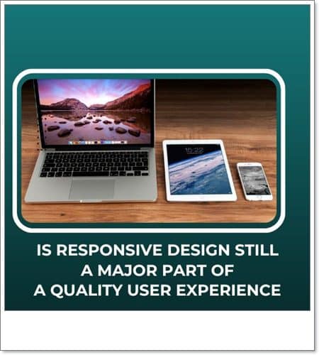
It should be clear from the beginning. Responsive design plays a major role in laying the basis of any good user experience. It is one of the core approaches of UX agencies and web designers to help their clients create a platform that adheres to the modern standards of consumers. It could even be argued that without it, you could be missing out on a huge number of leads.
Still, what exactly is responsive design? Why is it so important for any website that hopes to reach its audience? Read on and find out!
What is responsive design in UX?
The main goal of responsive design is to provide a seamless user experience on any device. Responsive websites are also known as “mobile-friendly” sites. Responsiveness is like water: it can take any shape depending on the container it fills. It is part of the core services of UX agencies.
Using this approach, the web design of any site will always adapt to the layout of the device your users are currently using. This will enable users to easily navigate your platform and find the information they seek – all key elements of a quality user experience. The main takeaway here is fluidity: a webpage with responsive UX design has lightning-fast loading times and can be easily viewed on every platform, whether your target audience is browsing your site via their smartphone, tablet, or laptop.
When has responsive UX design become so popular?
The answer is quite simple: responsive UX design became the cornerstone of every website basically at the same time smartphones got a boost in usage.
Around the early 2010s, everyone had to adapt to a major change in consumer habits. More and more people started using their smartphones to browse the web. As such, web designers could opt between 2 major approaches:
- Adaptive UX design. Often confused as a synonym for responsive design, but this is not the case at all. In this case, web designers can create different versions of an interface, one for each type of device users may use to access your platform. This means adaptive design uses fixed dimensions.
- Responsive UX design. Only one version of your interface is created, but instead of fixed dimensions, it incorporates flexible dimensions. As previously mentioned, the keyword here is fluidity: designing an interface that would either shrink or stretch to always fit the screen of the device used.
The advantages of responsive UX design quickly became clear. Instead of designing separate versions for each device, your target audience could use, it was much easier (and beneficial) to create one single design.
What are the basic elements of responsive UX design?
Responsive design has 3 core elements that contribute to a quality user experience:
- Fluid grids
Grid systems are the pillars which help designers arrange and structure information on your website. It helps make your user experience consistent. In the case of fluid grids, every element of your webpage will occupy the same amount of space no matter how small (or large) the screen becomes.
- Fluid images
Fluid images will always scale up or down to fit the current size of the device your target audience uses.
- Media queries and breakpoints
These two are inseparable elements. Media queries are filters that can detect the current dimensions of the device people use to browse your website, while breakpoints rearrange its design to make sure it fits the screen size.
Why is responsive design so important in UX? What are the benefits?
- You can improve SEO: search engines reward responsive sites.
- You can save time on development: no need to create different versions for each platform.
- You can ensure your brand’s consistency: coherent design on all platforms.
- You can reach more people: users browse a lot with their smartphones.
What are some of the best practices for responsive UX design?
Some of the best practices employed by UX agencies are valid for responsive design and user experience as a whole. Here are some of the most notable practices:
Mobile first!
By prioritizing smaller screens before tablets and desktops, you can be sure that your design will fit the most ubiquitous handheld device: the smartphone. Written content comes first: infographics and images can come later.
Simple is best
Minimalistic websites that are easy to comprehend and navigate through have a much higher chance of success.
3 breakpoints at the very least
Prepare designs that fit at least 3 different devices.
Disclose information progressively
Prioritize must-have visual content that gives away key information. Users are much more likely to read through your content if you don’t assault their senses with too much text at once.
What makes a quality user experience apart from responsive design?
While responsive design plays a vital role in creating a seamless user experience, there are many other aspects to creating the ideal digital platform. You can learn more about the most notable elements of quality UX by clicking on the ergomania.eu link.
Leave a Reply
You must be logged in to post a comment.